
Behind the scene: Life After Death?
2026-10-05
My latest piece is about the afterlife—or at least what humans believe about it. As I write in the piece, what we believe probably doesn't change what happens to us after we die. But it does tell us how we think of our world and our place in it. Go explore the piece, and come back here to read about the thinking behind it.
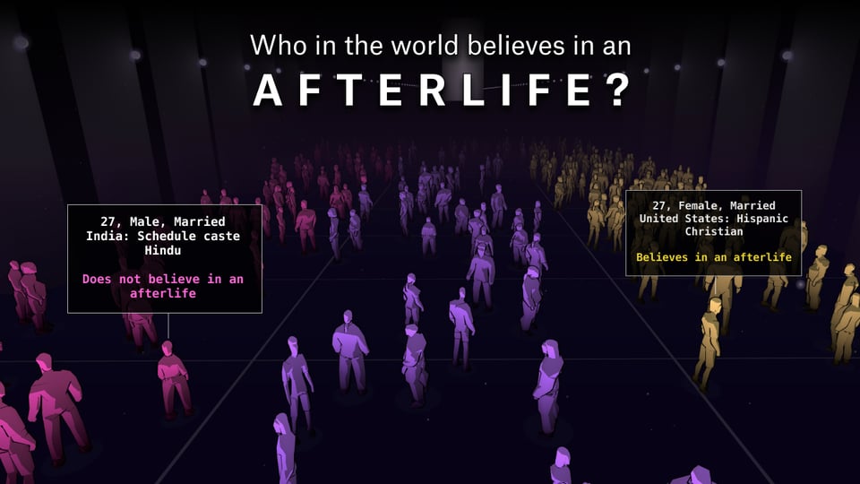
After grad school, the Boston Globe hired me as a data visualization journalist. I wasn't formally trained in any aspect of the job. The first time I was asked to make a chart, I asked myself: What is the proper way to visualize something?
Now, there are plenty of formalized rules around how to make various chart types, and some rigorous research to back up why we make those decisions. But up to that point in my career, I'd been a reporter and writer, and the process for creating text stories was relatively straightforward:
Gather information
Make sense of the information
Conceptualize a structure to communicate that information
Write the thing
I was particularly interested in points No. 2 and No. 3.
To me, making sense of information is about finding a meaningful structure. As I learn about a topic, my mind starts organizing the information into a sort of map without me even trying. This way of thinking was particularly useful in my new job as a data and visual journalist. Once I understood the information, I tried to draw what was in my head—and then interrogate why I drew it that way. During the nearly two decades of doing this, I couldn't ignore some questions that kept coming up:
Why do we make these pictures in our head to make sense of information? And how do we do it with invisible concepts?
As a writer, I could understand how different strands of information were woven together into meaning. I knew that narrative was a particularly potent tool because it conveyed cause-and-effect quite well—and, when done well, it can also reveal how a system works. When needed, I could also squeeze in some stats to support the piece.
But communicating visually meant that there wasn't always a formalized structure. There was often no inherent order, or embedded denotational meanings. It was merely: What can we put on paper (or the screen) to shoot light rays into people's eyes and, in turn, help them turn that into comprehension about our world? If you've followed my work, you know the winding paths I've taken to explore this question. It's involved unconventional charts, cartoons, videos, and interactive visuals.
In the background, however, I was obsessed with exploring why we (or at least I) make sense of the world spatially and visually.
The last four years, I've been writing a book that explores this question. One thing I've learned is that a growing body of research hints that we organize information in our head—and navigate it—using some of the same neural machinery we use to navigate physical spaces. This makes complete sense; the first thing living creatures have to navigate is their physical environment. It's critical to know where to find food, shelter, and whatever else we need to survive. Humans, of course, need more than just food and shelter—but beyond that, we are capable of constructing and navigating rich constellations of information that help us make sense of our world.
I've filed my manuscript, so hopefully you'll buy the book and read about this obsession sometime next year. But in the meantime, these ideas have infected all my other work, including this piece.
When I first started exploring a story about the afterlife, I immediately had several pictures that popped into my head. Can you tell I grew up in a Protestant household?
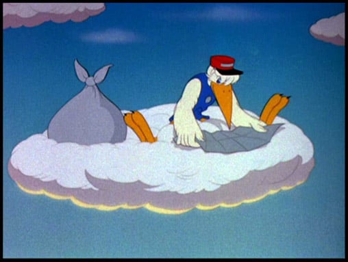
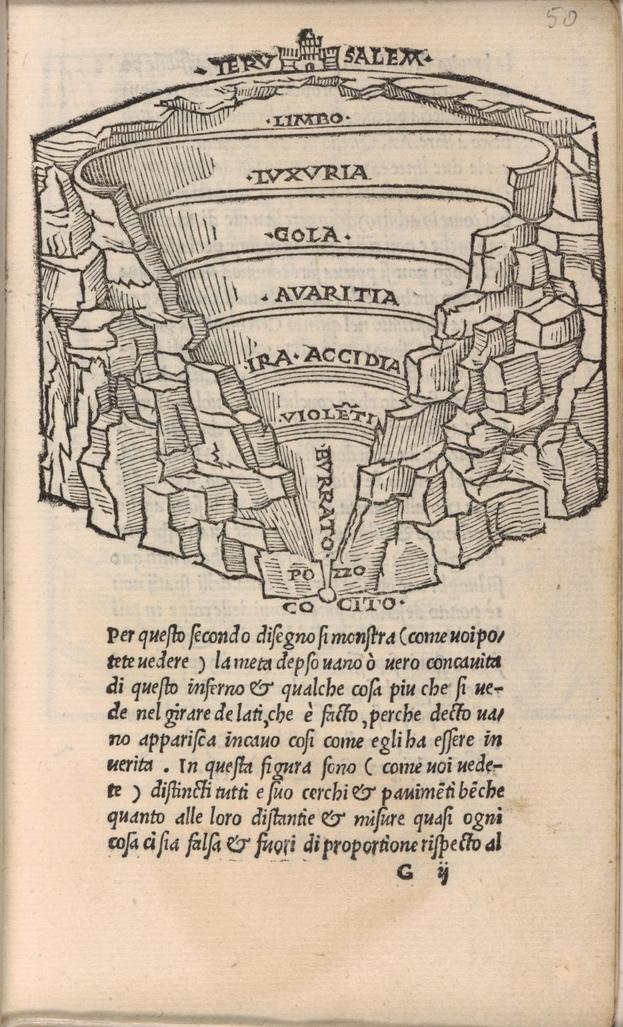
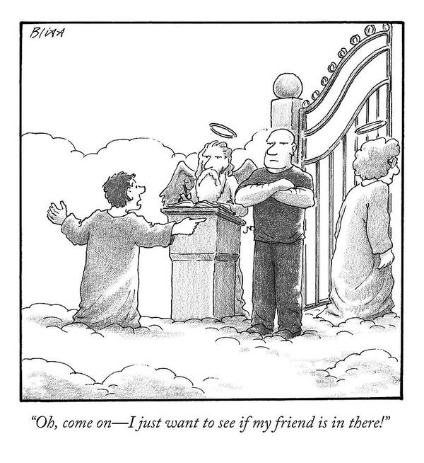
But when I thought about who believed in an afterlife and who didn't, I had a tough time understanding how to think about this spatially. If anything, I imagined a bunch of dots visualizing everyone in the world, and a randomized pattern of dots lighting up to represent those who believe.
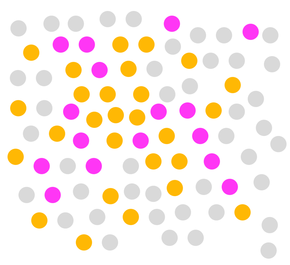
That's because, in my immediate surroundings, most people don't go around talking about whether they believe in an afterlife or not. We have many identities, religious or otherwise, that are related to beliefs in the afterlife. But beliefs are incredibly personal and volatile—even when it comes to something so big. You could change your mind right now, and there would be no external indication of it.
So I thought: What if we could see what people believed about the afterlife? In fact, what if you could see it when you walk into a room full of people? How would that make you feel about your own beliefs?
And thus was born the idea of creating a room where you could see something that is usually so hidden from us. Not only that, but I wanted to nudge the reader to use their mental mapmaking skills to orient themselves in the room—nonbelievers on the left, unsure people in the middle, believers on the right.
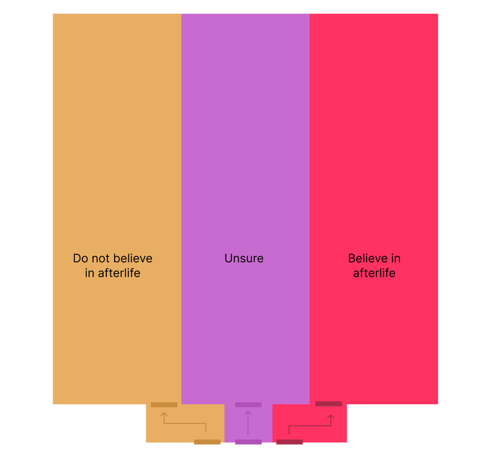
Data visualizations often try to tell the story from an allocentric viewpoint—focusing on the external environment, the bird's eye view, and perhaps helping you place yourself in it. In the case of this room, that means you'd experience it from this map-like layout. But I wanted to combine that with the egocentric view—the experience of walking through the room, not being able to see everyone in the room, but instead running into people with different beliefs. After all, that's how we experience the world!
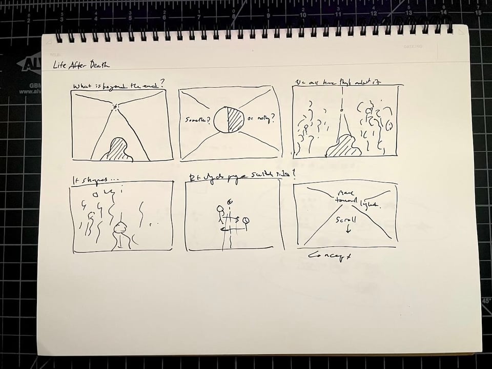
One thing I didn't want to do was create the sense that these were permanent places in the room—that once you walk in one door, you're basically stuck there. An early version of the room had walls between each section, but I got rid of those to show just how fluid these beliefs can be. I also wanted to show people walking side to side in the room early in the story to further reinforce how no one is permanently stuck there. The only unchangeable thing is how deep they are in the room, since that represents someone's age.
Ultimately, what I hoped to do was give the reader a sense of physical space to represent three invisible things: the inevitable passage of time, an inevitable end, and our agency to explore what comes after. If we really do understand large parts of our world through the maps in our head, then I figured it might be nice to have a thing that represents humanity wrestling with the Big Question—a sort of "social object," to borrow from my former professor, Clay Shirky. (In fact, when I told people I was building this room, it prompted fascinating conversations about where they stand and the journey that brought them there.)
A note on technical learnings: This app uses Three.js, which is a popular Javascript library for creating 3D scenes. My work is usually driven by pixel art—or 2D line art—so I hadn't explored this library too much. But, damn, what a cool library! This project also forced me to finally learn Blender, the 3D modeling tool. To get the variation on the figures, I used a Python script to mess with the models a bit. All this is to say: This is very cool but it's clear that I've built my work on placing pixels on the screen, and not building 3D models. For my next project, I'm thinking of veering into the opposite direction—something very analog, maybe even physical.
Don't miss what's next. Subscribe to Alvin Chang:

